

Why do all brands look alike?
Sans Serif, black and white, flat colors and white spaces. Large, medium and small brands are moving in this direction. What's going on? Why is this happening that is happening?
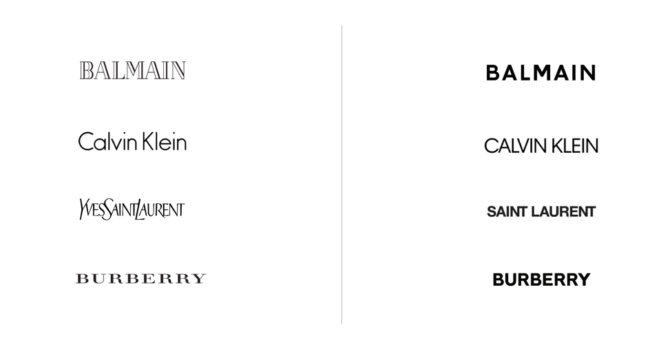
The evolution of the logo of clothing brands.
The Folch agency talks about Liquid Branding on its website and says Bland is the new Brand. It is through this agency that I found out that there was a term for the tendency towards homogenization in the logos of some brands. A fact: Folch not only used this term but also in 2019 they launched a postgraduate course in Blanding together with Acid House and Elisava. On the web they explain:
I understand what they are going for and I know that it is always convenient to put a name to things: order, control, understand. I don't know if I find it particularly innovative or remarkable that brands act strategically and adapt to environments, platforms and audiences that change all the time. It is what in one way or another they have been doing since the beginning of time, right?
I agree that there is a shift away from the strict, rigid and very long brand manuals towards a slightly more flexible model. Brands today have to be used for packaging, a TikTok and an ecommerce at the same time. In addition, they have to be prepared for sudden changes in the business or product. Example: if the brand is built for an app that allows its users to buy cakes at home and after a few months they add bread and cheese in the same way, it is necessary that the branding has not been fully rooted in the idea of selling cakes ( a logo with cakes, UI full of cakes, naming “Mr. Cake” etc.). An open and flexible branding will allow the app to grow, learn from users and add or modify its value proposition and functionalities based on the feedback they receive.
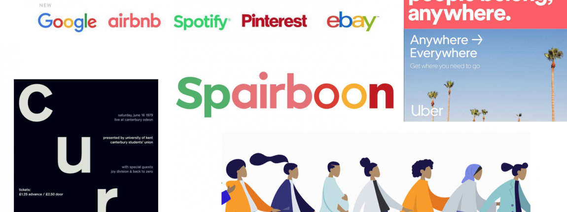
What I think is particularly striking about this whole trend is that big brands (as well as startups and cool entrepreneurs) have gone from wanting to distinguish themselves to wanting to be so similar. Why do they fold to this trend? What do Google, Airbnb and Spotify gain by making their logos similar? Do you want to go unnoticed? Why do they seem to "get rid of" their personality and go to almost absolute neutrality?
All this debate reminds me of this spectacular note published in The Outline in 2019. There, Rachel Hawley talks about Gotham typography. He says that when he closes his eyes and thinks of a word, that word is in Gotham font. That's how stuck in the brain we have it.
This typeface was designed in 2000 for GQ and released to the public in 2002. It's everywhere: Coke bottles, Twitter, Spotify, Netflix, NYU, Tribeca Film Festival, Saturday Night Live, the Obama campaign, and even the movie. Moonlight.
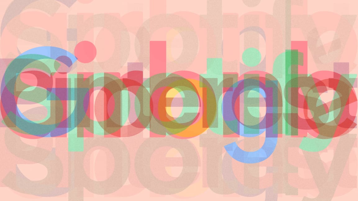
I think this note is a good precedent for this issue that they decided to call blanding. Also, I think it does a little deeper analysis. He moves away from the question of liquidity and Zygmunt Bauman and tries to find a cultural explanation for why in such a short time this typeface conquered the world and the hearts of designers and publicists.
Gotham is a sans serif typeface and has certain sizes and weights that make it read well both digitally and on giant billboards on the street. Hawley mentions that Tobias Frere-Jones, the creator of Gotham, told him that the goal in creating this typeface was to get a voice that was straight to the point, reflective of authority, and not too fancy or farfetched.
Gotham is, in a way, a tabula rasa, a blank slate that can become one thing or another depending on what they need from it. Gotham can become 100% fancy, 100% tech, 100% serious, 100% joyful. It all depends on what it is combined with.
Here I think a very interesting question arises. When blog posts, agency websites, webinars, conferences, courses and posts talk about blanding, most of the time they are talking about logos. It's the logos that get flat, sans serif, minimalist and everything we already know.
We compare old logos with new logos, logos from one industry and logos from another and we are surprised because everything is equal to everything and what a horror! What I'm wondering is: isn't this a bit of a reductionist view? Hadn't we agreed that branding is a set of many things and not just a logo? Didn't the value already go from the logo and the purely graphic and visual to the comprehensive communication strategy of companies? Why are we all generating so much content if not?
Just because the logos look alike doesn't mean that the branding looks alike. Today branding no longer happens only because a logo is in such and such a way. Branding strategies are communication strategies. Everything else counts too. Brands need to be soft, liquid and everything that has been talked about under the umbrella of blanding but, above all, they need to open up to all sides and achieve communication strategies that make sense with their objectives and resonate with their audiences. Perhaps they no longer need to innovate in their logos but they do need to transform their strategies, the way they present themselves to the world.
I don't think it's just a minimalist graphic form but rather a cultural phenomenon. Minimalism reigns today in the world of fashion, art, interior design and social networks in general. Nordic furniture, flat clothing and 2D illustrations signed by no one are everywhere.
There are some essays that call startup minimalism “blanding” and associate it with the idea that “they can sell anything”. Others connect it with the coming of age of the millennial generation. Not from a romantic side of minimalism along the lines of "letting go" or Marie Kondo, but understanding the generation as one that cannot buy a house or stay in the same job for 20 years, that has to worry about economic, social, health, political and environmental issues and that, perhaps, finds some comfort in the pure, straight, geometric and simple lines of an ordered typography that contrasts with the world that is set on fire again and again and again.
Be that as it may, for years they have been predicting that millennial minimalism is going to disappear but – at least for now – it continues and millennials – at least for now – don't have much choice but to indulge in minimalism. What I think is key is to highlight that what we call liquid brands is nothing more than the way brands sell products and services today and that not everything is in the logo.